Filling of the inspection template
The inspection template consists of a form, processes and steps. The process and step are not mandatory elements of the inspection template.
Form
Dynamic form - a form consisting of details that must be filled in when creating an inspection project in web-UI or in a mobile APP. Adding the details to the form should be started by adding a group of fields.
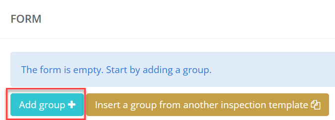
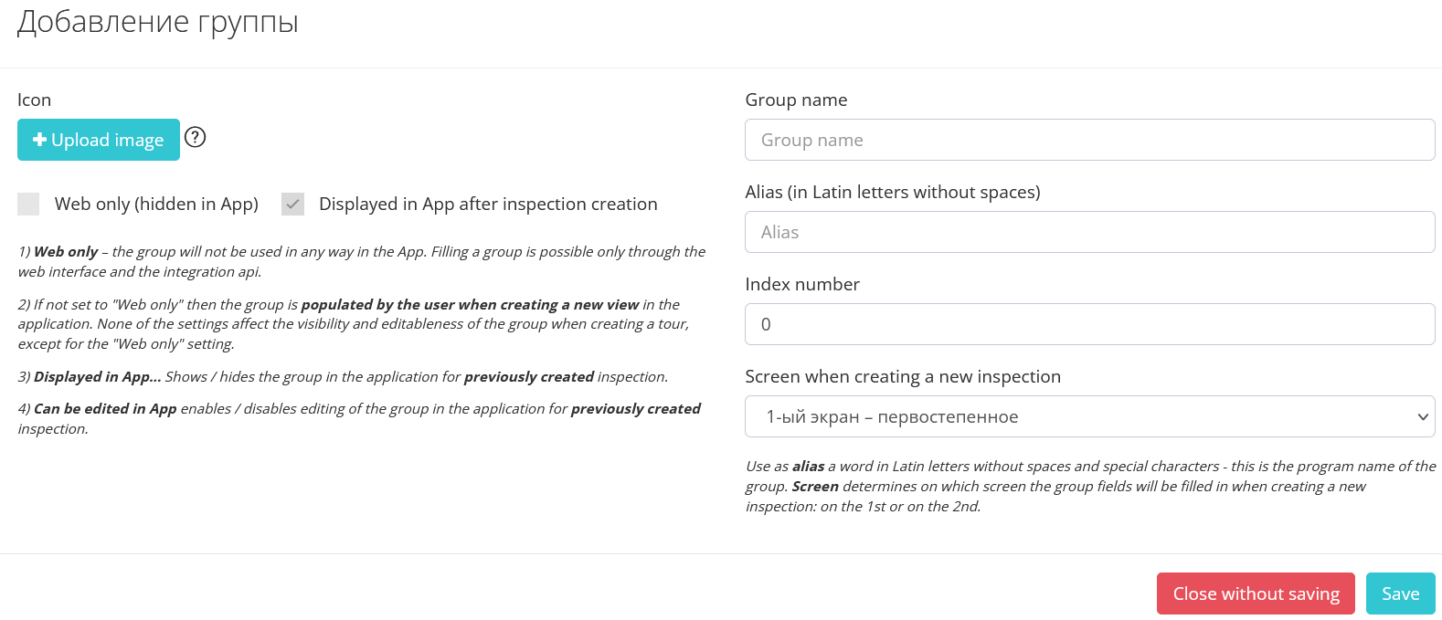
The Group creation window appears
|
Attribute |
Description |
|---|---|
|
Group name |
The name of the group of fields that will be displayed as a frame combining the fields in which the user must sel ect or fill in the field values. This frame conveniently separates fields that can be separated logically. Example: «Client». Accordingly, in this group of fields, the fields for the client will be conveniently located: full name, date of birth, passport number, etc. |
|
Alias (in Latin letters without spaces) |
Required props. It will be possible to receive inspection data via an external API through this account. During integration, it will be enough to show the IT department or the integrator the template settings so that it becomes clear to him which tags of the VIEWAPP API response will contain the corresponding values selected by users during the inspection.
Use the word in Latin letters as an alias without spaces and special characters - this is the program name of the group.
|
|
Index number |
Put the group number next in order. It can be filled in automatically. |
|
«Upload image» button |
By clicking this button, you can upload a small icon that is displayed as an icon of a group of fields
Types: gif,jpeg,jpg,png,tiff
Max resolution: 700x700px Max size: 300Kb (Gif 3Mb) |
|
Screen when creating a new inspection |
The screen determines on which screen the group fields will be filled in when creating a new inspection: on the 1st or on the 2nd.
|
Settings
|
Setting |
Description |
|---|---|
|
Web only (hidden in App) |
The group will not be used in the mobile APP. Filling in the group is possible only through the web-UI and the integration api. If the "Web only" checkbox is not set, then the group can be filled in by the user when creating a new inspection both in the APP and in Web-UI. |
|
Displayed in App after inspection creation |
|
|
Can be edited in App |
Setting this check mark allows/prohibits editing the group in the mobile-APP for a previously created inspection. |
Dependencies of Group Addition Settings
|
|
Web only (hidden in App) |
Displayed in App after inspection creation |
Can be edited in App |
|
Web only (hidden in App) |

|

|
|
|
Displayed in App after inspection creation |
Not available |

|
|
|
Can be edited in App |
Not available |
Not available |

|
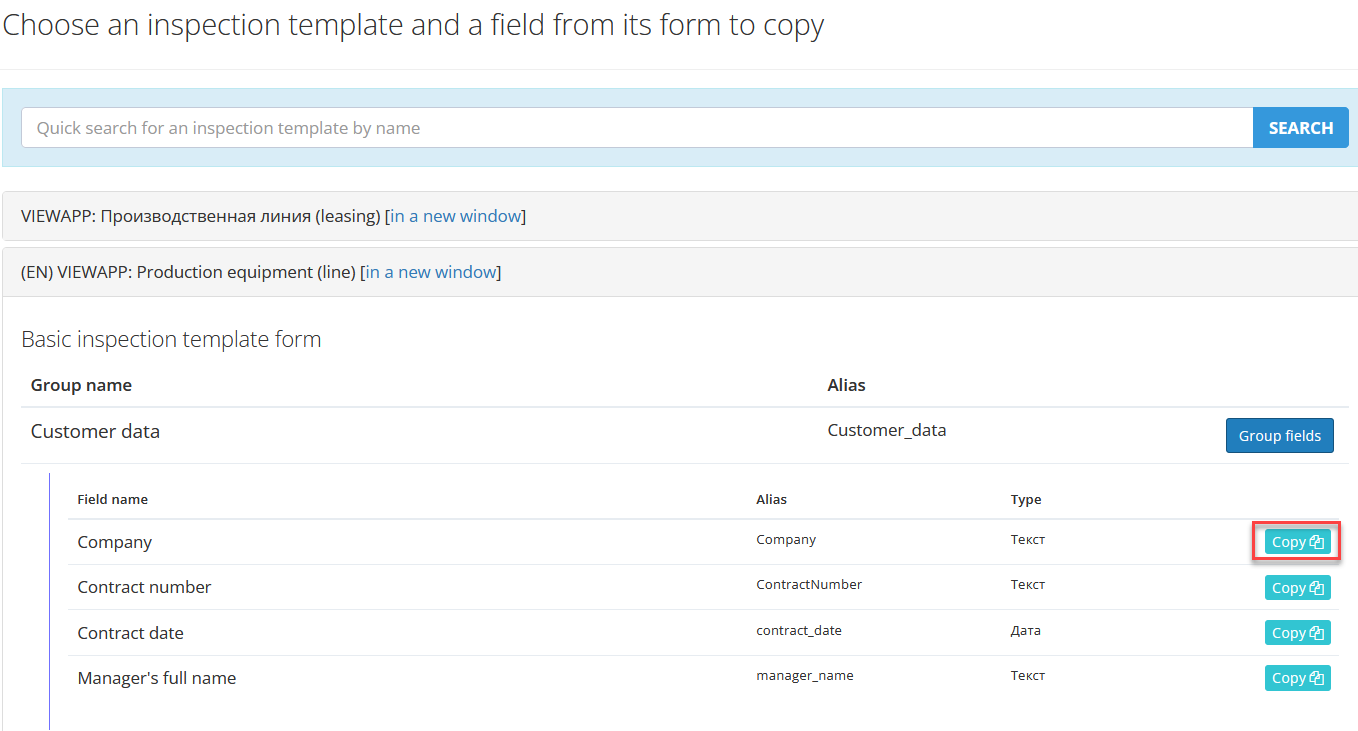
Make a copy of the fields
The system allows you to ins ert a group of form fields fr om another existing template
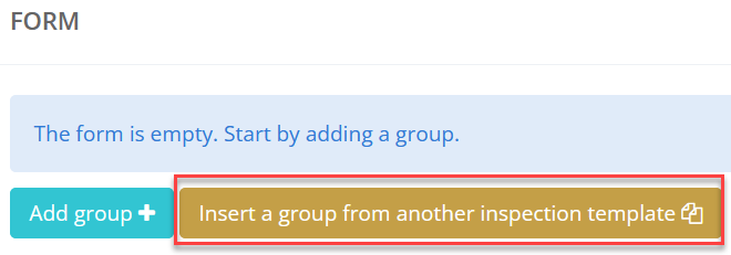
After clicking “Ins ert a group fr om another inspection template” list of templates appears
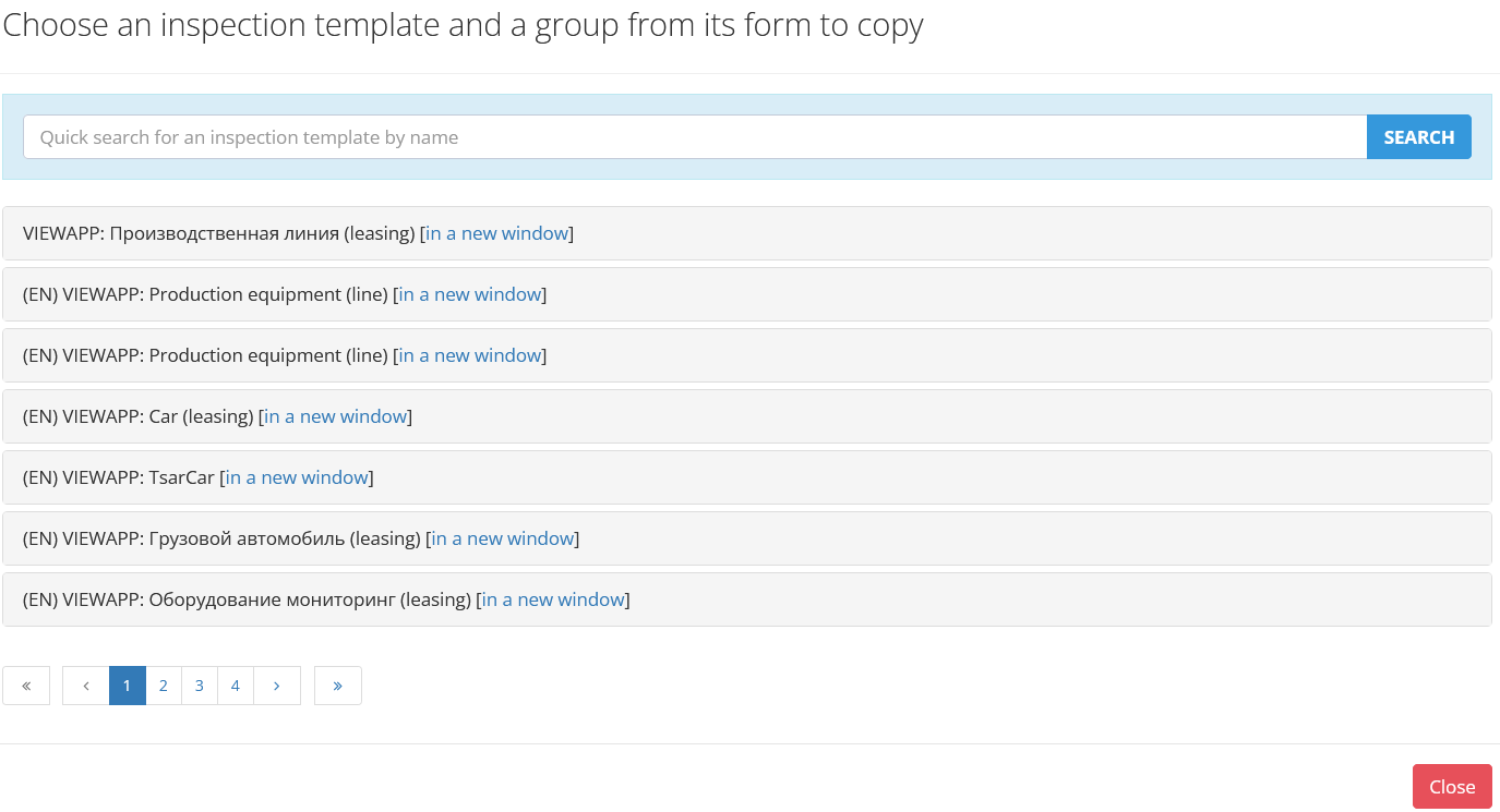
We can find the needed template using the search, or sel ect a template fr om the list. To copy the group to the templates, click theу “Copy”.
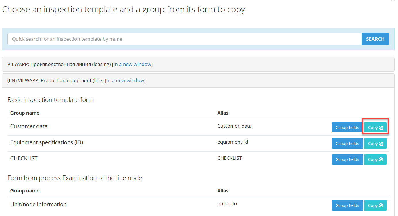
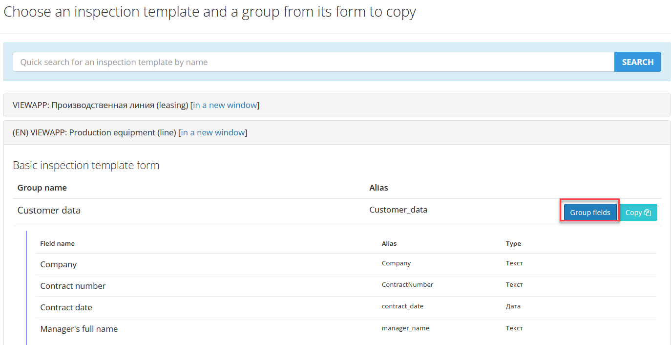
Using “Group fields” button you can view the composition of the fields.
After clicking “Copy” the selected form will be copied to the template.
Form Fields
The form is filled with fields. To create a field, click the button “Add field”.
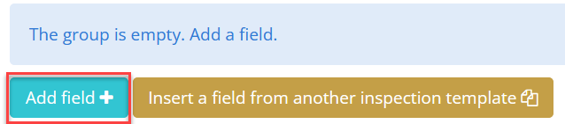
Window of field creation will opened
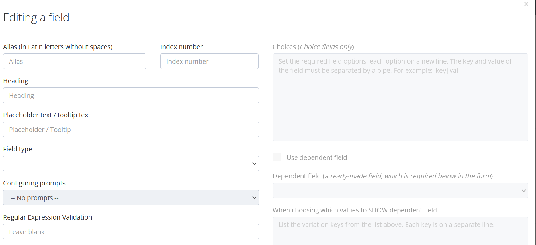
Fill in the field attributes
|
Attribute |
Description |
|---|---|
|
Alias (in Latin letters without spaces) |
Obligatory requisite. It will be possible to get inspection data via external API through this requisite. When integrating, it will be enough to show the IT department or the integrator the schema settings, so that it will be clear to him which response tags of the VIEWAPP API will contain the corresponding values, filled by the users when performing the inspection. |
|
Heading |
Name of the field, which shows over a enter information field |
|
Placeholder text / tooltip text |
You can write text in this field props, which will be grayed out in the input field. When user starts entering information, this text will disappear. It is convenient to use the field as a tooltip or information input format tooltip. However, it should be borne in mind that there will be no input format control in this case.
Examples:
|
|
Index number |
Put the next field number in order. Can be filled in automatically. |
|
Field type |
Choose a data type of the field. Specifies the type of data the user will enter in the field. |
|
Hints configuration |
Type a text for the hints, which shows to user while inspection. |
|
Regular Expression Validation |
Using verification of stored data using regular expression validation - regexp. PCRE |
Data types
|
Field name |
Data type |
Description |
|---|---|---|
|
Text field |
Regular data |
Random text |
|
Registration number |
Aggregate data type |
License plate |
|
VIN number |
Aggregate data type |
VIN number. There is a check for correctness (in WEB only):
|
|
Number |
Regular data |
Number. Opens the number keyboard. |
|
Date |
Regular data |
Date. Opens the calendar. |
|
Date and time |
Regular data |
Date. Opens the calendar with the time selection option. |
|
Selector |
Drop-down list |
Values are written in a special format. Format: key|val, wh ere key – alias of the list val ue, val (random) – value.
Example: Drop-down list of car colors:
|
|
Selector with search |
Selector with the editable field |
It will search for a suitable value fr om the list as you type. This field type is suitable for long sel ect lists. In this case, the values are written in the following format in the corresponding field.
Format: key|val, wh ere key – alias of the list value, val (random) – value.
|
|
Checkboxes |
Flags |
The number of checkboxes and their programming is similar to the formation of a list of values 
In this case, the values are written in the following format in the corresponding field.
Format: key|val, wh ere key – alias of the list value, val (random) – value.
|
|
Radio buttons |
Selector analog |
Radio buttons allow you sel ect one of the values: 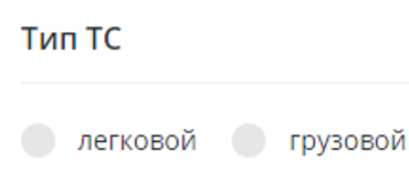
In this case, the values are written in the following format in the corresponding field.
Format: key|val, wh ere key – alias of the list value, val (random) – value.
|
|
Hint |
Random text field without editing |
Advisable to use before the fields, wh ere by the name and/or placeholder it will not be clear to the user what he should enter |
|
Russian passport |
Aggregate data type |
Separate data input by series (4 digits) and number (6 digits) |
|
Driver' license |
Aggregate data type |
Separate data input by series (2 digits) and number (6 digits) |
|
STS |
Aggregate data type |
Separate data input by series (4 digits) and number (6 digits) |
|
Full name |
Aggregate data type |
Separate data input by surname (random text), first name(random text) and middle name (random text) |
|
Dimensions (LxWxH) |
Aggregate data type |
Separate input by lenght (digits), width (digits) and height (digits). Used for easy reference of characteristics. |
Settings for data types with choice (Selector, Selector with search, Radio button, Checkbox)
|
Setting |
Description |
|---|---|
|
Choices (Choice fields only) |
In this case, the values are written in the following format in the corresponding field. Each value in new line.
Format: key|val, where key – alias of the list value, val (random) – value.
|
|
Use dependent field |
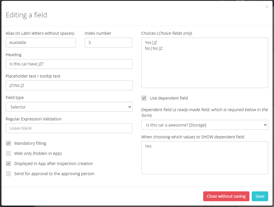
Logic of dependent field: If you sel ect the value with the alias "Yes", the dependent field selected in the "Dependent field" will appear, which must necessarily be located in the same group after the current field - in this case "Is this car have JZ?". |
|
Dependent field (a ready-made field, which is required below in the form) |
A field, necessarily lower in the form, which will appear if the corresponding values of the main field are selected. |
|
When choosing which values to SHOW dependent field |
List the option keys fr om the list above. Each key is on a separate line! |
Field settings
|
Setting |
Description |
|---|---|
|
Mandatory filling |
Required field |
|
Web only (hidden in App) |
To display or not to display the field in the app |
|
Displayed in App after inspection creation |
If not checked, the group can be seen and filled in only in the mobile application while creating an inspection (immediately after selecting the scheme, when the form is filled in). Later the user will not see this group in the mobile application If the checkbox is checked, the group will be visible later. |
|
Send for approval to the approving person |
This setting appears only if the scheme is marked with the: “Send for approval to the approving person“. If the value in this field will be changed after the creation of inspection by any user, the field will be marked orange, which means that the value of this field can check and "approve" only the user with the role of "Approve person". |
| The field may contain sensitive data | At the Inspection's page, the content of the field will be hidden from all users of the system, except those who have direct access to the inspection and admins |
| Highlight field | Highlight the field in the inspection check interface - on the Expertise page |
The system allows you to ins ert a field from existing scheme. Click the "Ins ert field from another scheme" button.
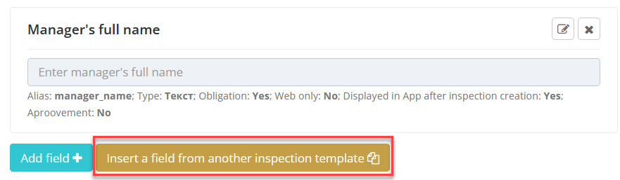
This will open a form of inspection schemes, fr om which we can sel ect fields. Use Search to find a scheme.
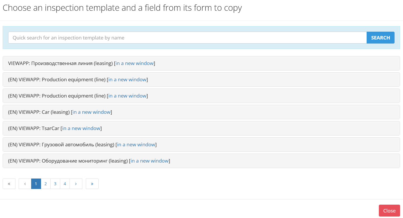
Choose the necessary scheme and fields of the group. Press “Copy” to copy fields in to scheme.
Additional files
Additional files can be added to the inspection template. These files will appear in the inspection created fr om this template.
Usually, additional files contain auxiliary reference information that allows you to better perform the inspection.
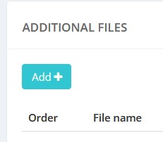
Click the “Add” button to open a window for adding a file appears.
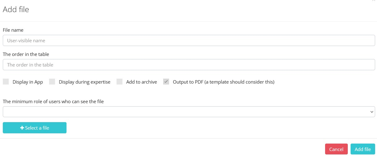
|
Setting |
Description |
|---|---|
|
File name |
File name to show in system |
|
The order in the table |
The order number of the file to sort. Sorting relative to other additional files in the scheme |
|
Display in App |
When enabled, the file will be available in the mobile app |
|
Display during expertise |
When the setting is enabled, the file will be available for inspection while in the state of “Expertise“ (in web) |
|
Add to archive |
The file will be saved with the inspection, when the inspection is transferred to the archive |
|
Output to PDF |
Info about the file will be shown in PDF form of the inspection. A template should be consider this |
|
The minimum role of users who can see the file |
The minimum role of the user who will see the additional file. Users with roles weaker than this will NOT see the file. |
|
Sel ect a file |
Selecting a file fr om the file system of the device |
The file will be added with choosed options after clicking an “Add file“ button.
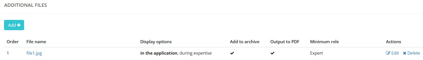
Options can be changed after adding. Press “Edit” for this.
To delete a file press “Delete” button.
Additional files will be shown in the inspection after creation.
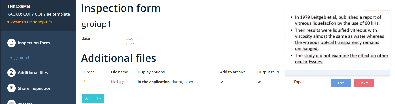
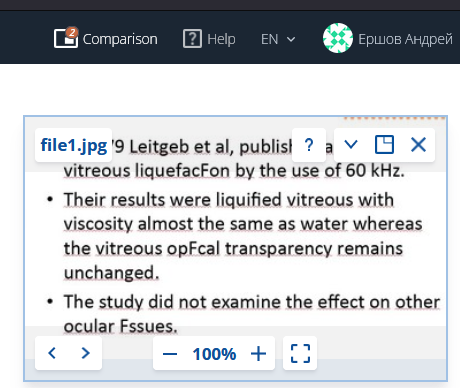
“Comprasion” button shows a file contents.
Processes
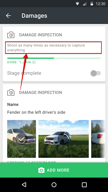
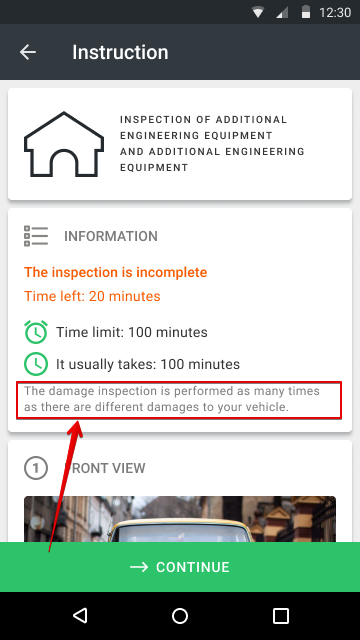
Processes (Stages) – are the steps of object inspection. Any inspection can be separate in to logical processes that the user must perform when performing an object inspection. Processes can be unrepeatable and repeatable.
Unrepeatable processes are performed once during the inspection. The process consists of inspection steps wh ere the user sees instructions and photo examples of how and what he should capture in a photo or video (camera angles).
Repeatable processes can be performed several times during the site inspection.
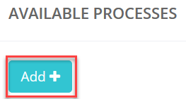
Press “Add” to add repeatable process.
The process creation window will open:
|
Attribute |
Description |
|---|---|
|
Name |
The name of the process that the user will see on the button when executing it in the mobile app. |
|
Alias (for integration) |
Obligatory requisite. Through this props you will be able to get the inspection data by external API. |
|
Name formula |
In repeatable processes, a dynamic form can be made for each such running process that the user has to fill in during execution. The formula is generated in the same way as the object name formula. Only the fields of the dynamic form created for this repeatable process can be used to form this name. |
|
Index number |
The number should be set automatically. Put the next sequential number by the number of processes in the inspection if it doesn’t. |
|
Hidden process |
Hide process in the mobile app. |
|
Process type icon |
You can download a small icon that adorns the button that starts the process.
Types: gif,jpeg,jpg,png,tiff
Max resolution: 700x700px Max size: 300Kb (Gif 3Mb) |
|
Getting coordinates |
|
| Calculate inspection's coordinate by this stage | The setting includes the calculation of the center coordinate by Stage - in addition to the overall center coordinate of the entire Inspection. |
| Allow steps choice during shooting | The setting allows the user to perform the steps in any order. |
|
Repeatable process |
If checked, the user of the mobile app has the opportunity to perform the process the required number of times.
Example: a room inspection makes a repeatable process because each building has N rooms. The user has to move fr om room to room, press the "Room inspection" button, fill in the name and dynamic form for each building and perform the steps of this repeatable process.
|
|
A Repeated Process is a process whose number of repetitions may not be limited. To allow the user to correctly terminate a Repeated Process, there is a customizable Wizard for exiting Repeated Processes. The Wizard screens can be configured with the settings described below. |
|
|
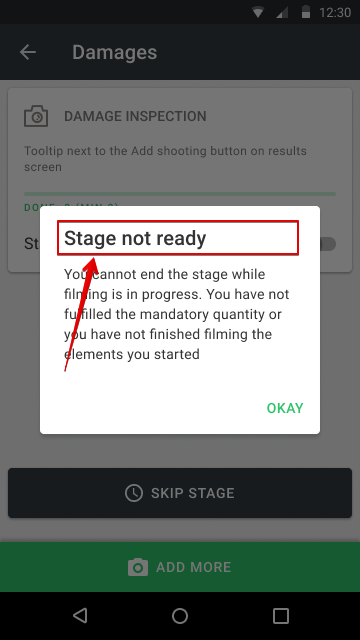
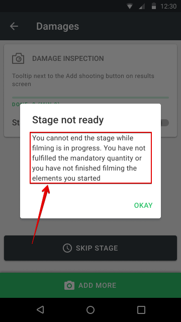
Minimum quantity |
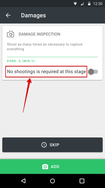
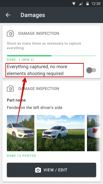
For repeatable processes the user will have to perform minimum of the specified number of shots. For example, if the process is about "Damages" then you will need to shoot at least N damages. And for each, perform all the scheduled steps of the repeatable process. Specify 0 if the stage does not have a mandatory minimum quantity. |
|
An alert header saying that it is too early to pull the switch before a minimum quantity have been achieved |
|
|
Alert text saying that it is too early to pull the switch before a minimum quantity have been achieved |
|
|
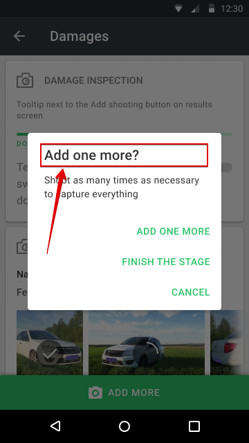
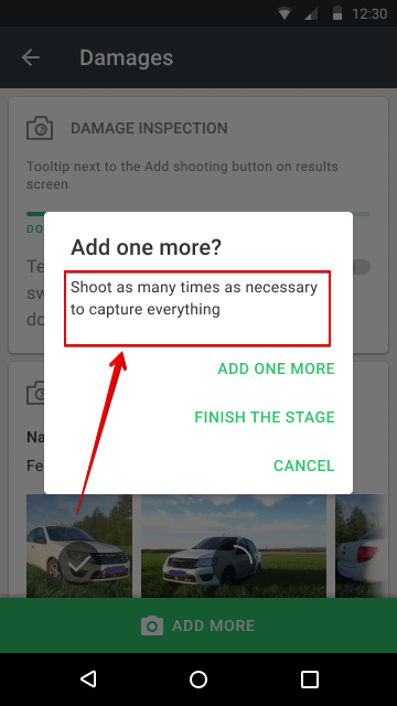
Header of repeat wizard |
|
|
Description text of repeat wizard |
|
|
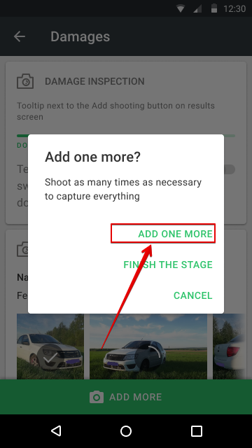
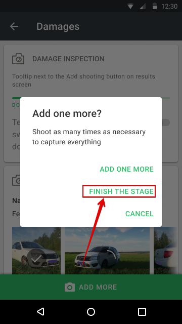
Button on repeat wizard about shooting one more element.
The name of the button is also used on the Expertise page in the WEB when creating a copy of the repeating process. |
|
|
Button on repeat wizard about finishing the stage |
|
|
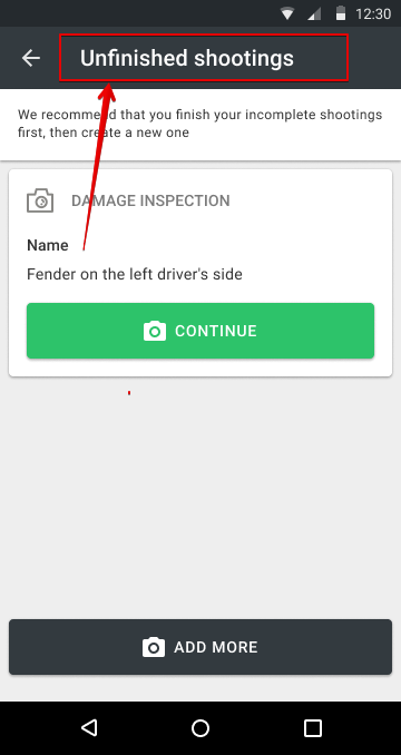
Unfinished shootings screen header |
|
|
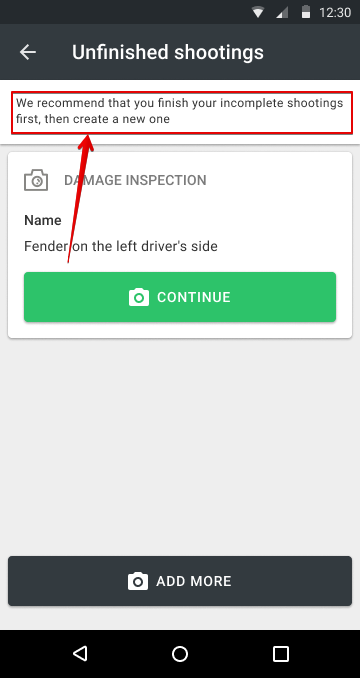
Unfinished shootings screen hint text (displayed when trying to create a new shooting) |
|
|
General explanation for repeatable shooting screen |
|
|
Label for the stage completion switch when no shooting has been done yet |
|
|
Label for the stage completion switch when at least one shooting in the multiprocess is done |
|
|
Footnote on the preparation screen |
|
|
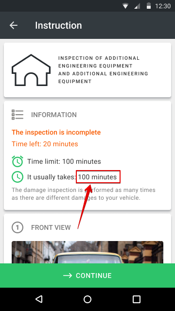
Tip "It usually takes N minutes" |
|
Steps
Inspection steps are single actions that a mobile app user must perform when executing a process. Each step has its own settings and must be attributed to the created processes.
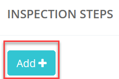
Press “Add” to add a step.
The Create Step window opens
|
Attribute |
Description |
|---|---|
|
Name |
Name of inspections step |
|
Alias (for integration) |
Alias in Latin letters without spaces |
| The step may contain sensitive data | At the Inspection's page, the content of the step will be hidden from all users of the system, except those who have direct access to the inspection and admins |
|
Hidden step |
Hide step in the mobile app |
|
Cover photo |
Use the photo of this step as the cover for the entire inspection in the Inspection List |
|
Orientation of tooltips |
The system has the ability to control how the user sees the tooltip of a step:
|
|
Cover photo |
If this option is checked, the photo of this step will be used as a photo in the list of inspections in the web interface and in the mobile app in the lists of inspections |
|
Method of execution |
|
|
Process |
The process (inspection step) to which the step applies is indicated. |
|
Video duration (sec) |
Limits the maximum duration of the video (for Method of execution = Video) |
|
Instructions |
A text description of what the user has to capture in the photo or video. |
|
Index number |
Put the next field number in order. Can be filled in automatically. |
|
Can be downloaded from phone gallery |
Checking this option enables you to upload pre-recorded photos and videos from the gallery of your mobile device |
|
Allow document scanning |
The setting allows the user to use the document scanning mechanism via the smartphone camera. |
|
Can be done in the web |
Impossible to perform the step in the web interface if this checkbox is unchecked |
|
Normal step |
This setting applies to the way you take photos, selfies.
Mandatory step - 1 photo.
|
|
Multiphoto |
This setting applies to the way you take photos, selfies.
You have to se t how many photos the user has to take From and To: With this setting, it turns out that the user has to take a minimum of 1 photo, and a maximum of 10 photos. After the user takes 1 photo, he can move on to the next step.
|
|
Mandatory step |
The "Mandatory step" sign means that this step cannot be skipped by the mobile app user on choise "Normal step" |
|
Minimum number of photos per step |
Specify the minimum number of photos in a step. Or do not enter a lim it. |
|
Maximum number of photos per step |
Specify the maximum number of photos in a step. Or do not enter a lim it. |
| Photo resolution | Setting the resolution of photos affects the quality of the image and the final file size. Option "auto" means to take the setting from the template. The actual resolution will depend on the available phone formats |
| Video resolution |
The resolution affects the video quality and the final file size. Option "auto" means to take the setting from the template. The actual resolution will depend on the available phone formats. Be very careful! Not all users will be able to shoot hi-res videos, even if the phone claims a nominal capability. Hi-res videos require an absolutely serviceable phone, a lot of free memory, and a suitable temperature. Otherwise, the user could have technical difficulties due to the fault of the phone. In addition, large files will take a long time to be sent to the server. It is recommended to use a resolution below average. It is suitable for most review tasks and anti-fraud. |
|
Panorama |
Warning: Experimental feature. Check with customer service before use.
|
| Analyse photo using neural networks |
Enabling neural networks to analyze photos. The neural networks allowed for selection are available by additional agreement. Please contact VIEWAPP to enable this functionality. |
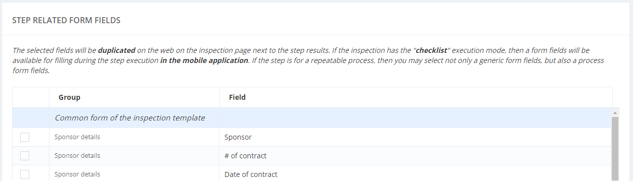
Step related from fields (Checklist)
For the "Checklist" inspection mode, it is necessary to link the form fields to the Step.
You can do it in the corresponding settings table in the Step Setup by checking the required Steps and Form Fields.
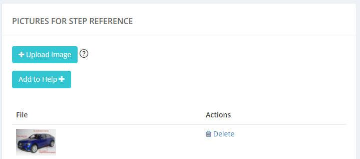
Setting Pictures for step reference
To display a hint picture when performing a step, use the "PICTURES FOR STEP REFERENCE" form in the Step Setup.
Press “Upload image” to upload a hint image.
Max size: 300Kb (Gif 3Mb)
It is also possible to add a hint to the Help, displayed before the start of the examination.
QUESTIONS FOR AN EXPERT
To create prompts for the Expert during the Expertise, use the “QUESTIONS FOR AN EXPERT” form on the Step Settings.
Adding a group settings
|
Setting |
Description |
|---|---|
|
Group name |
A group name |
|
Alias (in Latin letters without spaces) |
An alias - type in Latin letters without spaces |
|
Index number |
Index number, can by set automatically if empty |
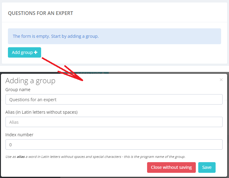
Press “Save” after editing.
Adding a field
|
Setting |
Description |
|---|---|
|
Alias (in Latin letters without spaces) |
An alias - type in Latin letters without spaces |
|
Index number |
Index number, can by set automatically if empty |
|
Heading |
Heading of field form |
|
Placeholder text / tooltip text |
Placeholder text in the field |
|
Field type |
Type of field |
|
Regular Expression Validation |
|
|
Mandatory filling |
|
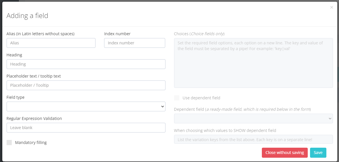
Press “Save” after editing.